Topics
- Article
- App & Features
- Behavior Impact
The WHOOP Monthly Performance Assessment and How to Interpret the Data
We explain how the Monthly Performance Assessment works and how to maximize the most insightful data WHOOP has to offer.
At WHOOP, our mission is to help you unlock your best performance with 24/7 personalized data. We’re also constantly striving to better enable our members to understand and interpret that data. Your Monthly Performance Assessments feature the most detailed and in-depth analysis available. Below we'll break down how to get the most out of your MPA.
SLEEP ANALYSIS
This page allows you to compare the current month to the previous month, as well as look at how sleep deprivation and restorative sleep changed over the course of the month. In the graph comparing your average sleep stats between the current month and the previous month, the left two bars show your average sleep need in green and average sleep duration in light blue, with the corresponding averages printed below. The right two bars show your average REM sleep duration in the lighter blue and average slow wave sleep (SWS, or deep sleep) duration in the darker blue, with corresponding averages printed below as well. REM and SWS together are considered “restorative sleep.”
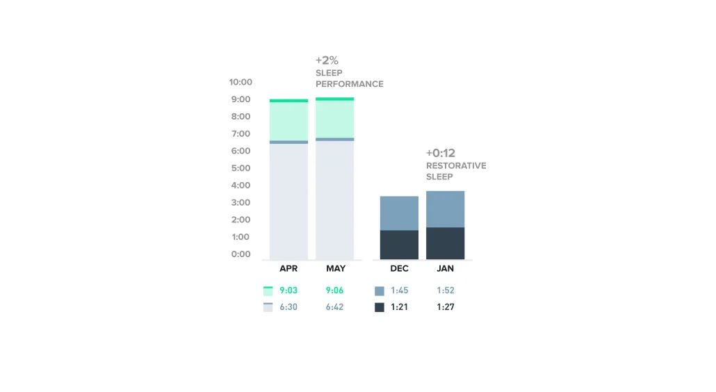
Your MPA compares sleep performance and restorative sleep from the past two months.
You can see that this member improved sleep performance by 2% between April and May by closing the gap between their sleep need and the sleep they got. They also brought up average nightly restorative sleep by 12 minutes. There are two graphs below that show the same stats as the summary graph above, but broken down by each day of the month.
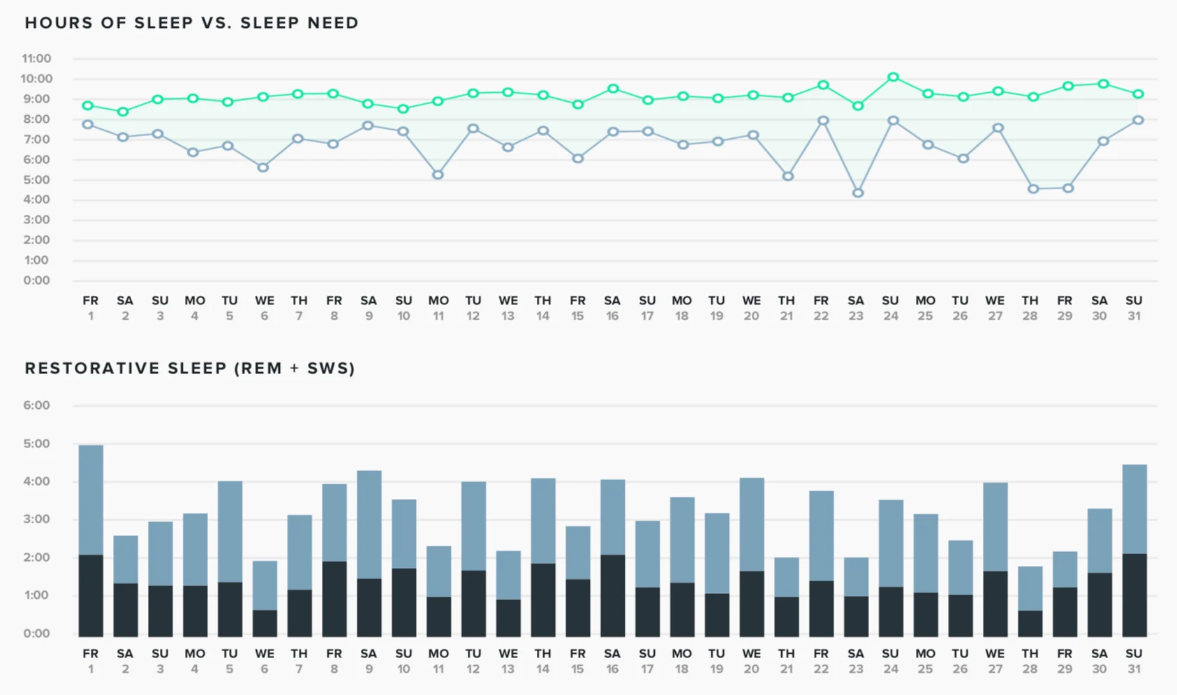
a day-by-day breakdown of your sleep vs sleep need, and nightly restorative sleep.
The top graph shows sleep need in green and sleep duration in light blue. For the most part, this member’s sleep need was constant throughout the month, indicating that their daily strain was fairly consistent and they didn’t let their sleep debt rack up. You can see a spike in sleep need on Sunday May 24th, since the night before this member only got about 4.5 hours of sleep. The goal should be to have these two lines as close to each other as possible, indicating that you achieved nearly 100% of your sleep need. The bottom graph shows nightly restorative sleep (REM and SWS), which illustrates how not all nights of sleep of the same length are created equal. For example, you can see that despite getting similar total amounts of sleep on May 1 and May 24, this member got about 1.5 hours more restorative sleep on the 1st.
Workout & Activity BREAKDOWN
This section of the Monthly Performance Assessment gives members a way of breaking down cardiovascular load by strain and time in heart rate zones across different sports and activities. This member recorded running, weightlifting, and golf workouts, as well as a number of unspecified activities in May. The Strain By Day of Week graph shows how much of your day strain comes from the different activities you log. The width of every bar and the strain next to each corresponds to your average strain on that day of the week. The colors in the bar indicate the amount of strain attributable to each sport/activity, with white space indicating strain accrued outside of your logged activities.

Your average strain by activity type and day of the week.
The figure above shows that the member's primary contributions to strain came from running (see color code in next graphic), which is supplemented by weightlifting and golf on the weekend. Based on the size of the Tuesday bar, we can determine that they ran consistently on Tuesdays and at a decent strain. The Friday running bar is smaller, which could indicate they ran every Friday at lower strains or that they might have skipped a Friday run once or twice during the month. We also provide summary statistics about workouts logged and show a comparison to the previous month. This member logged a total of 24 workouts in May, compared to 19 in April. Of those, 17 were running, 5 weightlifting, 1 activity, and 1 golf. They worked out for a total of 24 hours and 1 minute during May, with an average workout strain of 11.7. Running activities yielding the highest average strain and weightlifting the lowest. The member also extended their average workout time to 1 hour, an 11-minute increase from April.

A summary of your activities for the past month, with average strain and duration.
Different heart rate zones can impart different training stimuli, and the Heart Rate Training Graph shows your total time in each zone over the course of the month (color coded by the contribution of each activity type). This member has a fairly even spread across heart rate zones, with running workouts making up the bulk of time in the 70%+ zones. They rarely exceed 70% of their max heart rate when playing golf or weightlifting.

The average amount of time you spend in each heart rate zone for each type of workout logged.
The last section of this page is the Training Intensity Graph, in which we plot strain against duration for each activity in the past month. This graph shows you how long it took to earn various strains across your different activity types. You can see that this member’s running activities range from 20 minutes to 2 hours, but stay within the 8-15 strain range--their more intense runs took less time to complete. The member's weightlifting activities are all within the 5-9 strain range, but took between 45 minutes and 2:15 to achieve these strains. You can use this chart in conjunction with your Strain Traget to decide the sport and duration that will get you to your goal strain for the day.
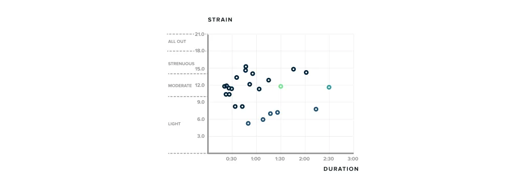
The training intensity (comparing strain vs duration) of each of your activities.
Strain, Recovery & Sleep HEATMAPS
Next up are the strain, recovery, and sleep performance heatmaps, which show your daily data for the last year across these three key metrics. The goal of this page is to give you an overview of how you are trending throughout the year. Averages by weekday are displayed to the left of the heatmap, and averages by month are displayed below. The darker the color of the strain boxes, the higher the strain for that day. As mentioned in the training and activity breakdown, you can see this member began working out harder in May than they did in April.
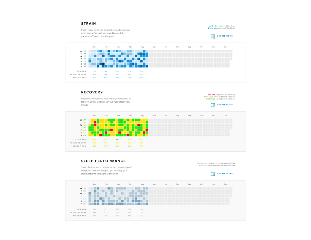
Heatmaps for daily strain, recovery and sleep allow you to spot trends in your data throughout the year.
You can also see a progression from light to dark in the sleep performance heatmap, showing that this member has started closing the gap between sleep need and sleep achieved. Their May sleep performance was 5% better than February. This member also has a mix of yellow and green recoveries with only a handful of red recovery days in there. Due to the way our recovery algorithm normalizes to each individual member, most people have an average monthly recovery in the yellow.
TRAINING & RESPONSE
This page of the Monthly Performance Assessment puts all the data into context by showing how you balanced strain and recovery (top), and how your cardiovascular fitness (bottom) responded to that training over the past 6 months. The top graph is adapted from the first page of your Weekly Performance Assessment, but shown as a time-series instead of a scatter-plot. The gray line shows the difference between your optimal and actual strain, with higher values indicating periods of overreaching and lower values indicating restorative periods. Sustained periods of overreaching or restoring are highlighted in red and blue, respectively.

charts illustrating how your body responds to training stimuli, including trends in HRV and RHR.
In the bottom section of the page, you can see how your body responded to your training behavior. If you were overreaching and then your heart rate variability and resting heart rate improved, that’s a sign that the overreaching was functional and you are more fit because of it. If, however, your HRV and RHR got worse following the overreaching period, that can indicate non-functional overreaching. Similarly, periods of rest can result in a physiological restoration that enables harder training and better performance - think tapering before a big competition - or can lead to loss of fitness and detraining. Looking at the top and bottom graphs together can help to understand if your training had the intended impact. This member's data shows that a long period of restorative training in January and February negatively impacted HRV and RHR. In March you can see they started getting closer to optimal training, followed by a short period of overreaching. The green lines on the HRV and RHR adaptation graphs in the spring months show how their cardiovascular fitness came back to the levels they had in January. We encourage you to make the most of your Monthly Performance Assessment by aiming to improve your stats month over month.